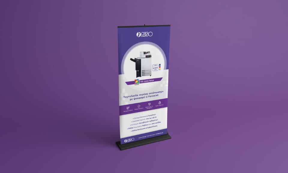
Project Description
RISO is a world leader in professional printing, offering innovative solutions that boost productivity and ensure the lowest printing costs in the market. Over the years, it has managed to develop a strong global reputation for its innovative products and exceptional customer service. The term “RISO-ing” has become synonymous with printing among 180 countries around the world.
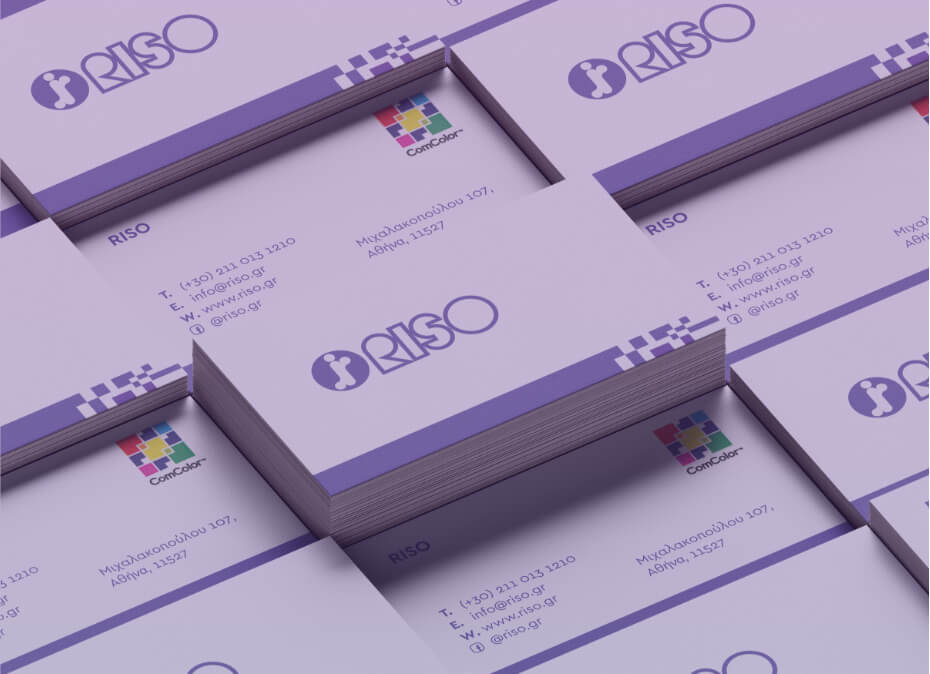

For the rebranding of RISO, our goal was to give a modern and approachable dynamic to its corporate identity, maintaining as basic elements the professionalism and prestige that the company reflects.
Corporate Rebranding
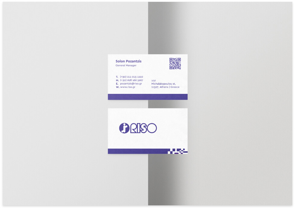
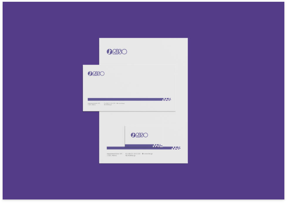
Our goal was to create a collection of consistent elements (business cards & corporate brochures) that would identify the company in harmony. The dominant colors we used were purple and green, inspired by the company’s signature color palette.
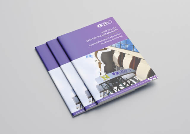
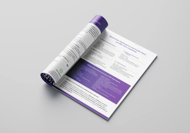
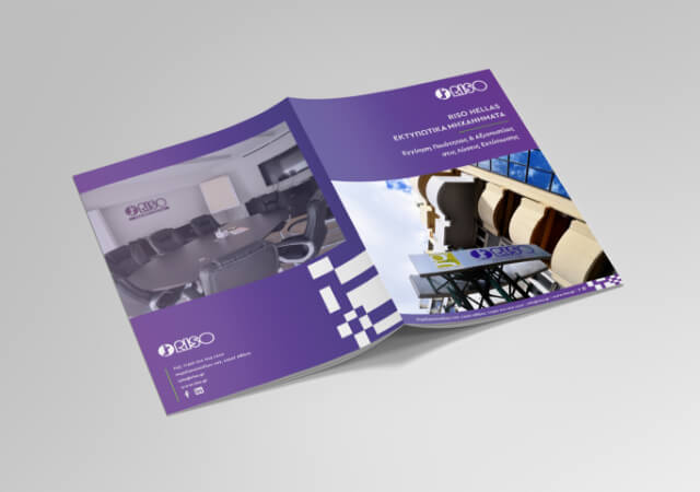
Brochure Design
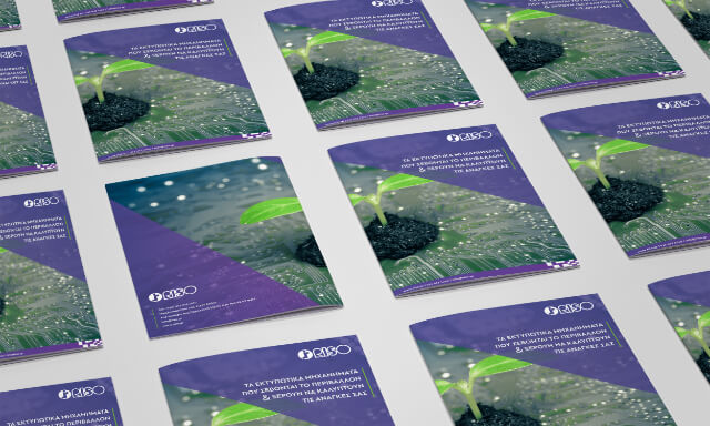
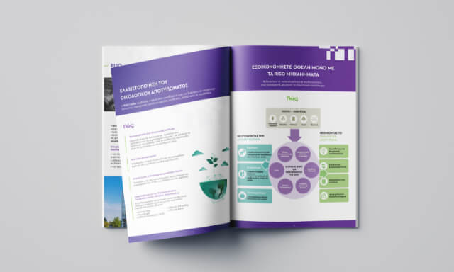
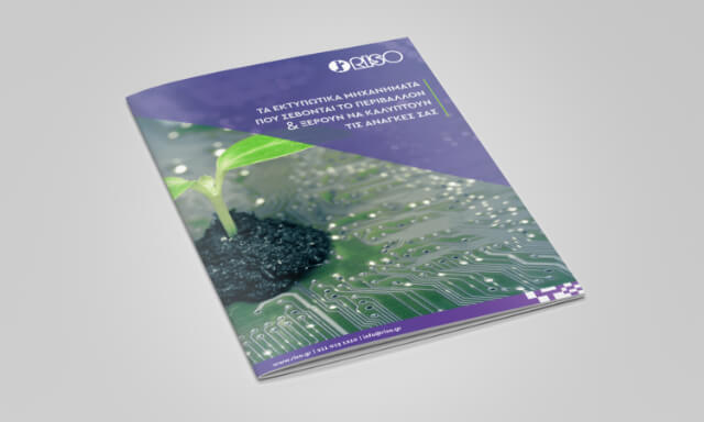
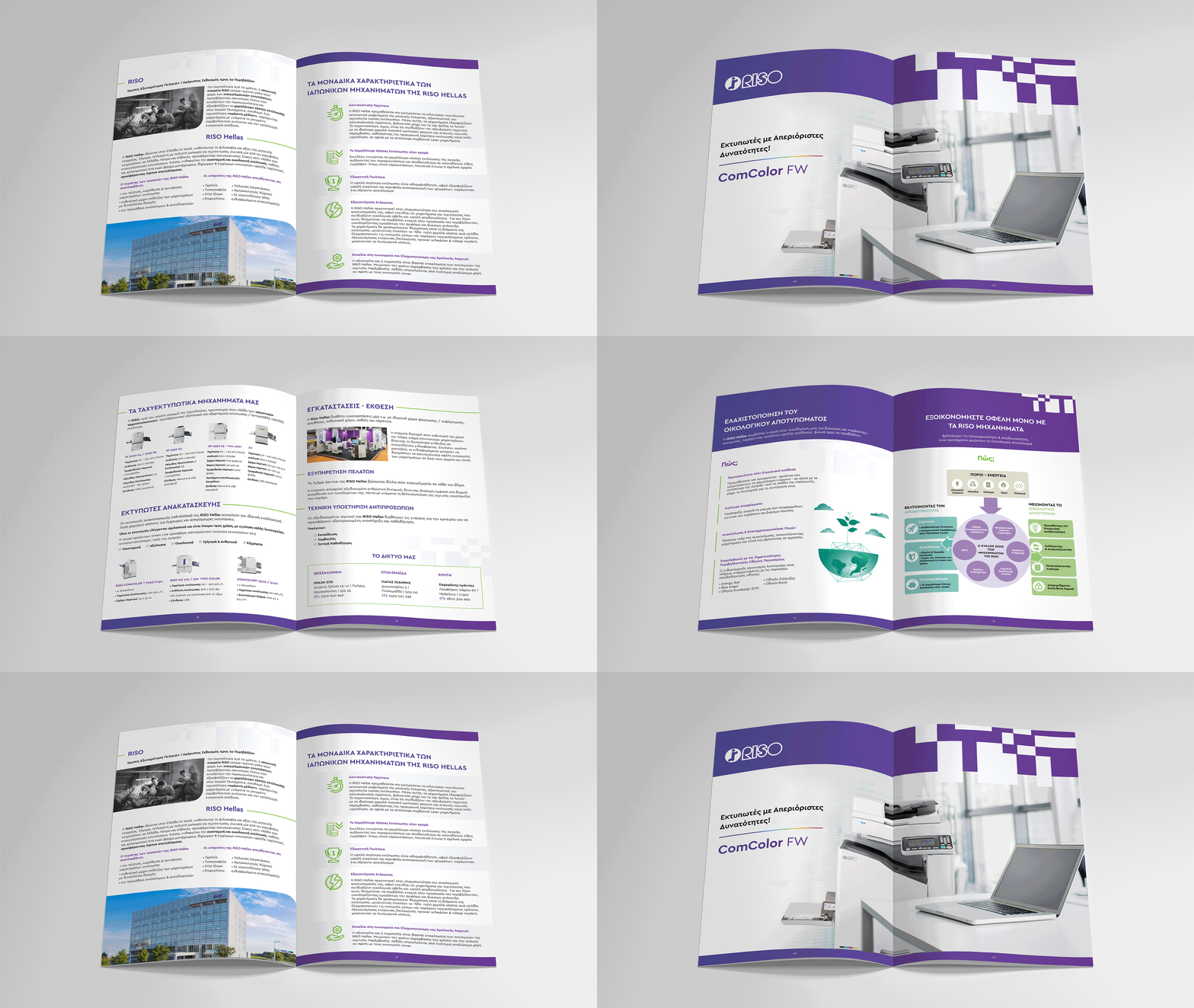
For the company’s brochure, our primary goal was to highlight the content in the best possible way. To achieve that, we chose a white background that makes the content comfortable to the eye. At the same time, we wanted to design a modern layout, where purple and green will define the creative.
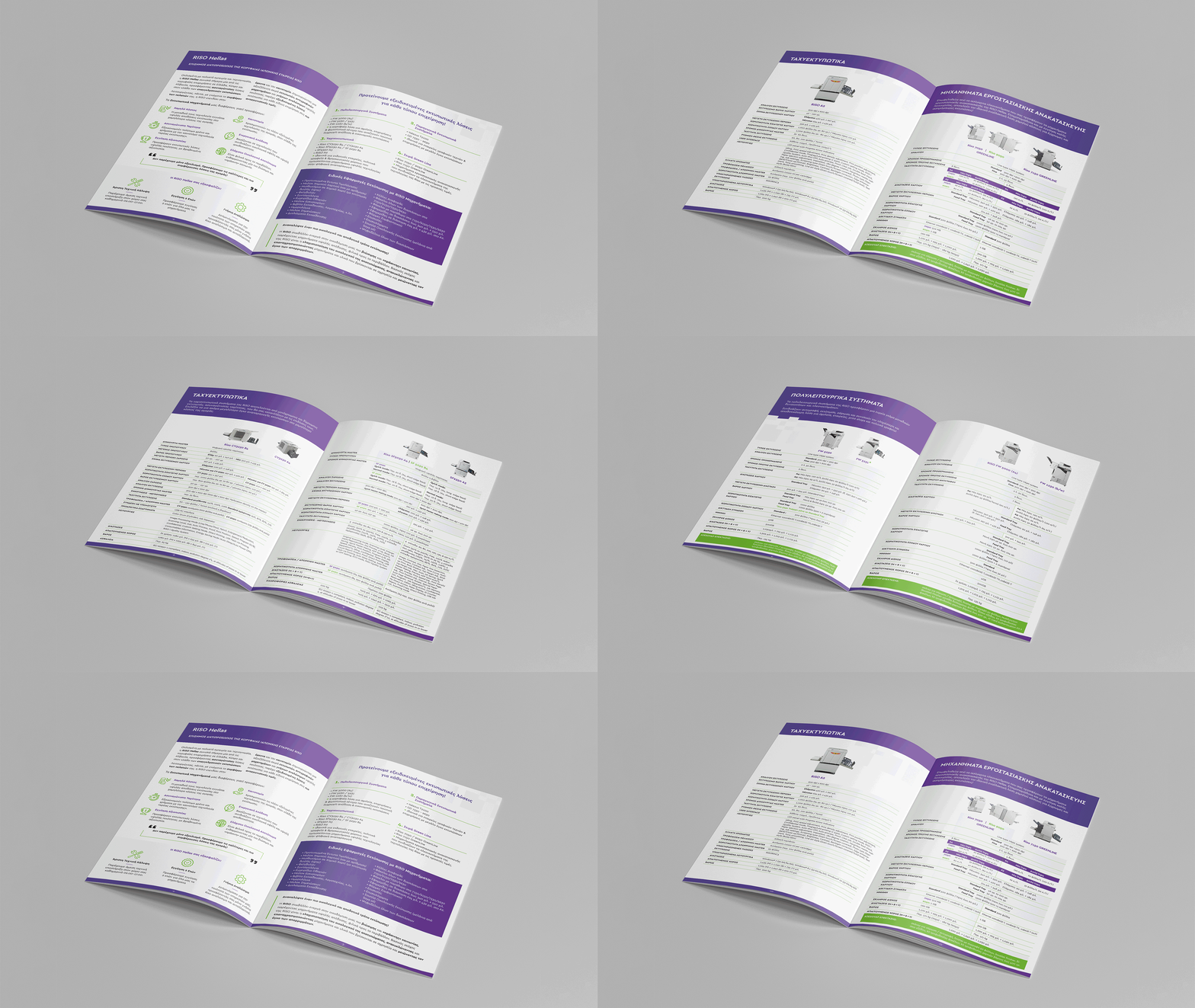
Machine Brochure Design
In the same way, focusing, always, on the company’s customer-centric philosophy, we proceeded with the design of the brochure related to RISO’s machines. We wanted to ensure that the reader can easily find the machine that interests them and get informed about the characteristics and advantages of each printer.
Banner & Packaging Stickers
